During the first part of the time passing brief we were given an image with which we were to attempt to create 40 different rough compositional sketches of different viewpoints that could be imagined within the image. This at first confused me until I spoke to Anna and she explained the idea behind what we were to do and some ideas to get started with;
-If a person was in the image, what could they see from where the stood; could the see the scene from a different perspective or could they see an entirely different scene?
-Where there are few characters in the image, can you show the scene from the perspective of someone looking through a window or a door?
– Zooming in and out from the image, or from one of the viewpoints you’ve already done, as if from the perspective of a bug on the floor, or a spider in the corner of the room, or as a bird looking down from the sky.
-Could you look at the same scene but from a different angle, or through something like a tree, or past a building to obscure part of the image?
-Is there any detail within the image you can focus on, such as a plaque, a window, a person, a door or the body of a car?
-Imagine something just outside the frame of the image, such as down the street, round the corner, behind the door.

I personally began this task by doing the most simplistic ideas first; as the main subject of the image is of two old fashioned Rolls Royce facing each other behind a large grand entrance to what can be assumed to be a hotel around the 1930’s. I started by drawings the cars from a variety of perspectives, such as through the window of on of the cars, which I tried to imagine could see the door of the hotel in the shot, with the street at night with street lights blazing. Following these ideas I just thought about how the scene, or a scene nearby may look from a different persons point of view.
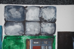
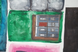
After sketching out as many of the initial ideas as I could imagine, I began to add colour and subject to the sketches, the first few of the sketches I added colour to, were quite dark and sinister, as in the photograph you can clearly see it is an image taken in the night, and I was trying to accurately represent that, but it came of quite dark and eerie, which would later inspired me in the next stage of the work. After the first few sketches I experimented more with brighter colours, so rather than dark colours like black, grey and dark blue with highlights of colour, I was using green, blues, violets, reds, oranges, and yellows, I tried to choose colours I thought reflected wealth and strength, as the context of the image is obviously showing the elite, the wealthy, the upper class. I chose to use watercolor because I thought it was a good medium to create both an sinister washed blend of colour that can be used to make an image look sinister, as well as create strong bold colours needed to represent wealth and class.
In the critique at the end of part one, the main feedback was that they contrasting use of colour, and the variety of techniques I used but how their was a similar style visible in all the images. They picked out the more abstractly created ones with bright stand out colours. With that in mind, I chose the images and the styles I most liked and were effective in story telling, and then I went about using the images I created, but changing them to illustrate a story, inspired by both the images we created and by the original image. Considering both factors, I was inspired, and as the dark sinister feel of the initial sketches I made and the Rolls Royce’s inspired to make a 1930’s mobster hit and run, shooting down some rich guy, who’s had problems with the mob in the past, and then people just staring at him shot against a wall.


With some initial ideas down, the second part of the project started with a briefing on narrative and time passing, in this briefing we were shown how different artists use cropping, technique, content, composition and colour to demonstrate time passing, such as a scribbling quick rough sketches that are undefined drawing gives off the impression of a short period of time, rushed, or a fast moving scene. Or the positioning of characters or subject making something feel like an event is going to happen, for example, seeing something smaller or in the distance creates the impression something will happen.
I began creating my story by doing sketches of all my scenes, to see if the story was cohesive, and then I drew in the subject matter, and decided on what style/colours I would be using in each. These images contained ones very similar to my original sketches, changing only small details, like the colour scheme but then some of the images are also very different to my original, but inspired by them.
I decided to present all the different images centred on white/cream paper, to stick with the black and white original image, however I decided against making it into a book, as I thought the images looked best when lined next to each other.


After completing the final images I decided that if I did the task again, I would add a few more scenes before the death and the main subject, maybe giving some indication why he was murdered, although I don’t know how I would do this, maybe using a prop in the drawing, like a poker/black jack table, showing that he had problems with gambling, and maybe that would indicate that he owed the mob, or stole from them. I also feel like a few of the images I could have done to better standard.
